
xMoney Checkout SDK Demo: Your Checkout, Live Before You Integrate
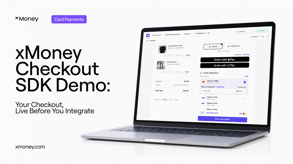
Explore xMoney Checkout SDK through interactive payment demos. Test payment flows, customize the experience, inspect events and see the code behind your checkout.

Choosing a payment solution usually starts with a lot of questions.
What will the checkout actually look like? Can it fit our brand? What happens when a payment fails? How much control will our team have? What does the integration look like? And what happens under the hood when a customer clicks Pay?
Usually, answering those questions means jumping between product demos, design mockups, documentation and technical conversations.
We thought there should be a better way.
With the refreshed demo.xmoney.com, you can explore xMoney Checkout SDK as a working experience rather than simply reading about it. Run payment flows, change the configuration, see the result, inspect what happens behind the scenes and open the code that powers it.
Don't just look at checkout… put it through its paces
The new demo environment is designed around a simple idea: the closer you can get to the real experience before integrating, the easier it is to make the right decisions.
You can explore complete Payment Form experiences or build a checkout from individual embeddable components. Cards, saved cards, Apple Pay and Google Pay can be tested where supported, alongside different customer journeys including subscriptions, saved-card flows, multi-step checkout and card verification.
This means a product team can experience the checkout as a customer would. A designer can see how it behaves inside a particular visual system. A developer can investigate exactly how the pieces connect.
And everyone can work from the same reference.
Plenty of ways to make the payment checkout yours
There is no single way a checkout should look.
A fashion brand might want a highly editorial, multi-step experience. A subscription business might want its own Subscribe button and a streamlined payment flow. Another merchant may simply want a polished, ready-to-use Payment Form.
The refreshed demo lets you experiment with all of these directions.
Change themes, colours, typography, borders, field states, button behaviour and wallet presentation. Adjust the order, currency, locale or appearance and see how the experience responds. You can even compare completely different branded checkout environments built on the same underlying payment technology.
The point isn't to make everyone build the same checkout.
It's to show how much control they have over their own.
Card checkout isn't a black box
For developers, seeing the payment screen is only half the story.
What happens between loading the checkout and receiving the final payment result matters just as much.
The demo's event inspector makes that lifecycle visible. You can run a scenario and see events such as readiness, validation, payment processing, payment changes, completion and errors, complete with timestamps and payloads.
You can also open the implementation alongside the experience.
The code view includes client-side SDK initialization, configuration, event handling, runtime updates and server-side order creation and signing. Configuration examples can generate code based on the choices you make while experimenting.
So instead of going from “I wonder how this works” to a documentation page, you can go from “I just tried this” to “here's the code behind it.”
Built for the people who actually have to ship it
The payment conversation rarely belongs to one person.
Product teams care about the customer journey. Designers care about the interface. Developers care about implementation, behaviour and control.
The refreshed demo gives each of them something useful to work with.
For merchants and product teams, it provides realistic checkout journeys to explore before committing engineering time. You can compare different approaches, test payment scenarios and see how checkout fits into the wider customer experience.
For designers, it provides a playground for exploring how payment controls adapt to different brands, layouts and interaction patterns.
For developers, it brings the running experience, SDK events and implementation code into the same place, with examples for configuration, runtime updates and cardholder verification.
That makes the demo more than a showcase.
It becomes a shared reference point before, during and after the integration conversation.
From checkout experiment to implementation
The most useful part of a demo is what happens after you find something you like.
That's why the refreshed experience connects configuration with implementation. You can change the checkout, see what that change does, inspect the resulting behaviour and open the corresponding code.
For teams evaluating xMoney, this shortens the distance between seeing a possibility and understanding how to build it.
See the payment layer from every angle
A payment integration shouldn't need to be imagined from screenshots.
You should be able to see the customer experience, change the design, test different scenarios, watch the SDK respond and understand what the implementation looks like.
That's what we've built into the refreshed demo.xmoney.com.
See it. Style it. Inspect it. Build it.
Explore the live xMoney Checkout SDK demos → HERE
Latest Articles
.webp)
.avif)
.avif)


.avif)













Join 20,000+ businesses already growing
We build and integrate solutions. You grow with xMoney.
